
13. September 2022 By Eva-Maria Kynast
Navigation for your website
Why is site navigation so important?
Every software and application requires site navigation that shows the user where they are and where they can find the information they are looking for. You may have come across a website that really annoyed you because you could not navigate to the page or information you were looking for. And if the website did not offer a proper search function, you left the site feeling dissatisfied and frustrated. The website operator clearly would like to avoid this, which is why they added a navigation function. But it may not have been the right choice given the contents of the website, or the site navigation may have created after the website was built and had grown over time. It is important that every website and digital application provide the following information to users at all times:
- Where am I now, and how did I get here?
- How can I go back, or where can I go from here?
- What other information can I access from here?
Navigation is an essential part of your application. It should therefore be well thought out. It is a table of contents for your website or application and can be shown as a simple list or as a menu. It provides a clear and quick overview and shows users where they can find every function and what they can expect to find on the site.
But how can you create a site navigation that does all this, and what do you need to keep in mind? To answer these questions, let us now take a look at the different types of navigation available.
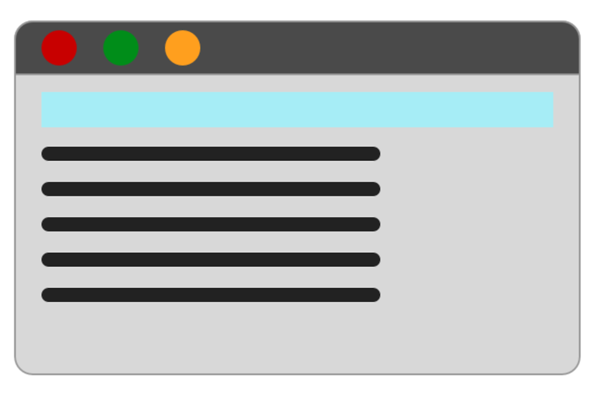
Horizontal navigation
The most common and best known type of navigation is horizontal navigation. This is a great choice especially for small sites since only a limited number of elements will fit in them. This menu is accessible from any page and can be placed on the left, in the centre or on the right of the page. It may in cases span the full width of the website. It can also be fixed so that is shown to the user the entire time, even when the user scrolls up or down the contents of the page. If a dropdown menu is added to the horizontal menu, many more entries can be displayed.
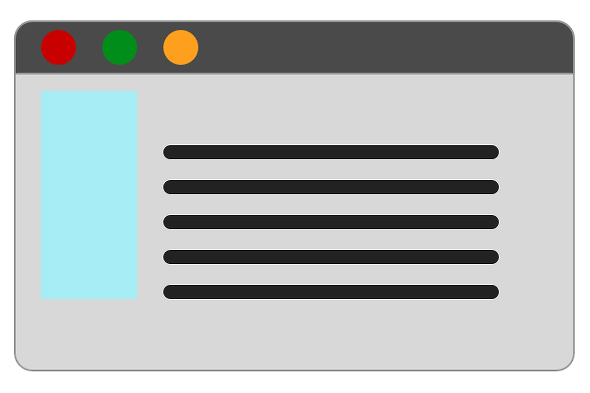
Vertical navigation
The first websites typically featured vertical navigation, as this was the most popular way to guide the user through a site at that time. Today, this type of navigation is more commonly seen on older sites or as a secondary menu on online shops. The trend has shifted away from vertical navigation due to the ever-growing amount of content found on websites. Most websites are built to cover the entire width of the screen. Because of this, placing the navigation on the side would take up too much space.
Drop-down menu
Drop-down menus have been around for some time. Some find them helpful, while others find them annoying. They provide more space for additional menu items that would otherwise clutter up the main (horizontal or vertical) navigation. A drop-down menu is accessed by moving the cursor over it or by clicking a link in the main navigation. A list opens below the menu containing further pages, links or internal hyperlinks.
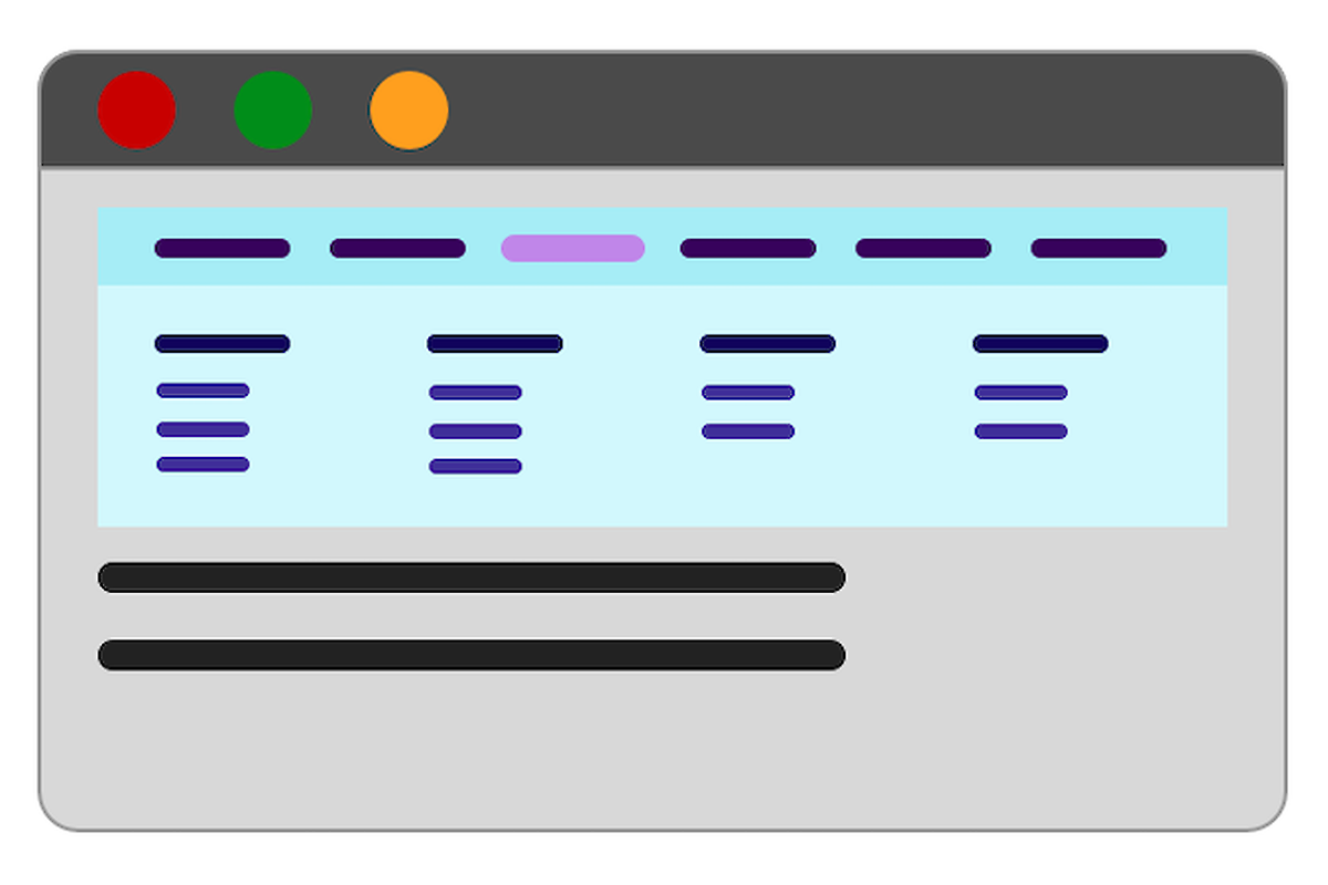
The mega drop-down menu is the drop-down menu’s big brother. This menu extension is used in very large navigations. Online shops that offer a wide assortment of products were the first ones to use them. If the number of items in the drop-down menu grows too large and creates a crowded screen, a mega drop-down menu is created. The menu window is made larger to offer more space for different categories and subcategories in order to provide users with a clear overview of all products.
Off-canvas navigation
Off-canvas navigation is another type of navigation. Here, the menu for the user is completely hidden behind an icon or button until the user clicks on it. It is most commonly found on mobile apps, for instance, as a hamburger menu. Off-canvas navigation is also employed in desktop applications, though less frequently than in mobile apps. Since the user first has to search for and find the navigation, this form of navigation still has its critics.
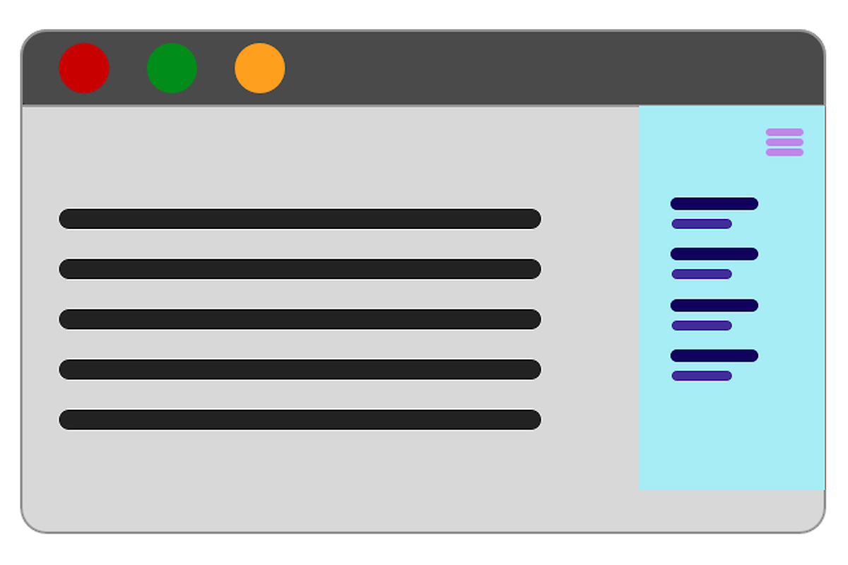
Page overlay is off-canvas navigation’s little sister. Here, the navigation is shown across the entire screen, meaning it takes up the full page, not just a small section of the page or header.
Here is a quick look at the pros and cons of each form of navigation:
Horizontal navigation
Pros
- Only a small number of clicks required
- Very popular because users always know where to find it
- Optimum visibility because the navigation moves when the user scrolls up or down
- Saves space
Cons
- Limited number of links possible
- Additional drop-down menu covers website content
Vertical navigation
Pros
- No limit on the number of menu items
- Clear structure with several navigation levels and categories possible
Cons
- Requires a lot of space
- Can quickly become cluttered and confusing for users
- Navigation may not be shown on the screen on very wide websites
Drop-down navigation
Pros
- Offers a lot of space for subcategories
- Can be expanded at any time
- Several levels are possible
Cons
- Quickly feels cluttered
- Website content is covered when user makes a selection
- Can be difficult to use for users if flyouts are integrated into the drop-down menu
- Can quickly become cluttered
Mega drop-down navigation
Pros
- Possible to view/click any page shown in a single overview
- Offers a lot of space and is expandable
- Visual structuring is possible
- Icons and small images can be integrated
Cons
- Can quickly become cluttered
- Must be adapted for different website widths
- Requires well-structured categories
Off-canvas navigation
Pros
- Requires the least amount of space
- Extensions are possible
- No difference between mobile and desktop versions
- Visual structuring is possible
- Icons and small images can be integrated
Cons
- Can easily be missed by users
- More clicks required
- Always requires the user to take action to get to the navigation
Eight tips for your site navigation
1. Place the navigation at a familiar location
Users like to be able to get a quick overview of a website. Having to search for the navigation would cause frustration and be an unnecessary waste of time. Help users find their way around the site as quickly as possible and place your navigation in a place that would be familiar to them.
2. Have the navigation be part of your website
Set aside enough space for the navigation so that it is easy to see and is clearly set apart from the content of your website without appearing out of place.
3. Make sure it is easy to read
The individual navigation elements should be easy to read and there should be sufficient space between them. Indenting sub-items is also important, as is highlighting the menu item the user is currently on. As with other website content, select a font size and type that is easy to read.
4. Do not forget key-based navigation
Since some users cannot navigate with a mouse or touchpad, you should make sure that the user can also navigate through your website using his or her keyboard.
5. Make the navigation interactive
Do not write your menu as running text. Let the user know that each menu item is clickable by using hover text or effects.
6. Choose a logical structure
Logical, coherent categories are needed for large menus. This way you split long menu lists up and help the user find his or her way around more easily. Images or icons can also help provide a quicker overview, provided they are used logically.
7. Mobile users also need to be able to navigate the site
Check if your site navigation works and is easy to read on different mobile devices. In many cases, it will be necessary to create a separate mobile menu. Horizontal menus for desktop devices are typically replaced with vertical menus for mobile devices. Certain elements may be fully hidden or categories may be placed in a different order. Take the time to properly adapt the navigation for mobile devices and enable the user to use your application without any frustration.
8. Leave breadcrumbs to allow users to find their way back
Incorporate the ‘breadcrumb’ menu on every page to always show the user his or her current position and how he or she got there. Also make the individual breadcrumbs clickable, so that the user can also go back quickly.
Conclusion
There are many different ways to navigate users through a website or application. Which option is best depends on your target audience, your requirements and the amount of content you want to show. Perform user tests to check whether all of the content is found and is easily accessible. Does the user find his or her way around your site easily, or does he or she have difficulty navigating or finding specific content? Take as much time as you need to plan your menu and do not rush the process. If you do it right, the end result will be higher user satisfaction and greater success.
You will find more exciting topics from the adesso world in our latest blog posts.

Category: |
|
Tags: |
UX Design User Experience |